Process Overview
|
section 1/7
Research
Assisted Story-Telling with CMU Students
|
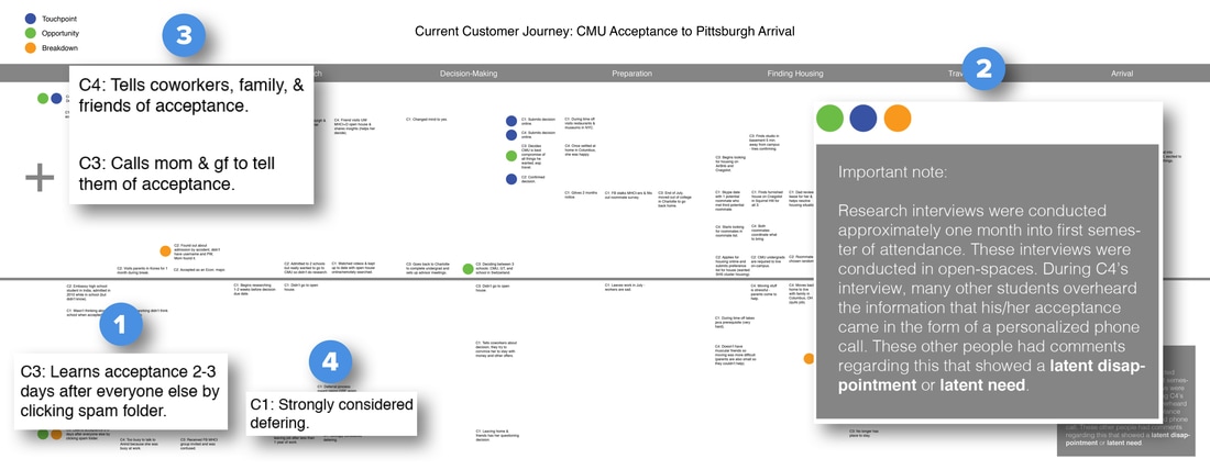
During the fourth and final interview, the interviewee mentioned that she received a phone call from the director of her program informing her of her acceptance and opportunities that she, specifically, would be interested in as a student at CMU. This interview was conducted in an open space. As she spoke about this experience, other students felt neglected and disappointed they didn’t receive similar phone calls. Additionally:
|
- Accepted students often immediately share their acceptance with their colleagues, friends, & families
- Accepted students often felt overwhelmed with the information about attending CMU
- Accepted students often received acceptance notifications in SPAM folders
section 2/7
Reframing the Problems
Prompting Creative Design Ideas

|
To avoid acceptance notifications from getting lost in SPAM folders, accepted students would be sent an SMS message informing them that their admission results are available.
|
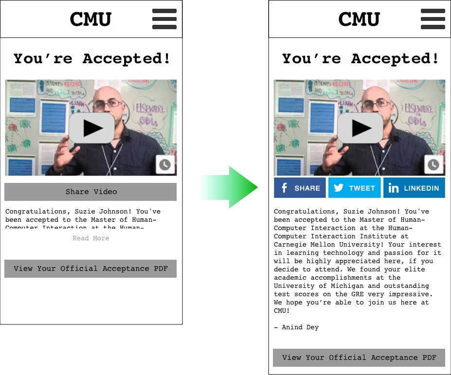
Instead of asking the director of each institute to call every student they admit, the directors would record short videos informing admitted students of their acceptance creating an equitable yet unique admission notification.
|
We would provide share buttons for the student to share his/her admission video. This would provide the student the affordance to inform her/his colleagues, friends, and families of his/her admission.
|
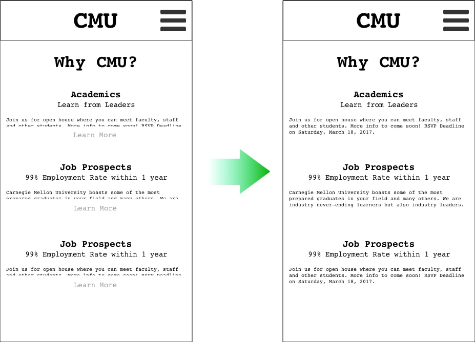
Only minimal university and program information would be included in the website. This would serve avoiding overwhelming the student.
|
section 3/7
|
|
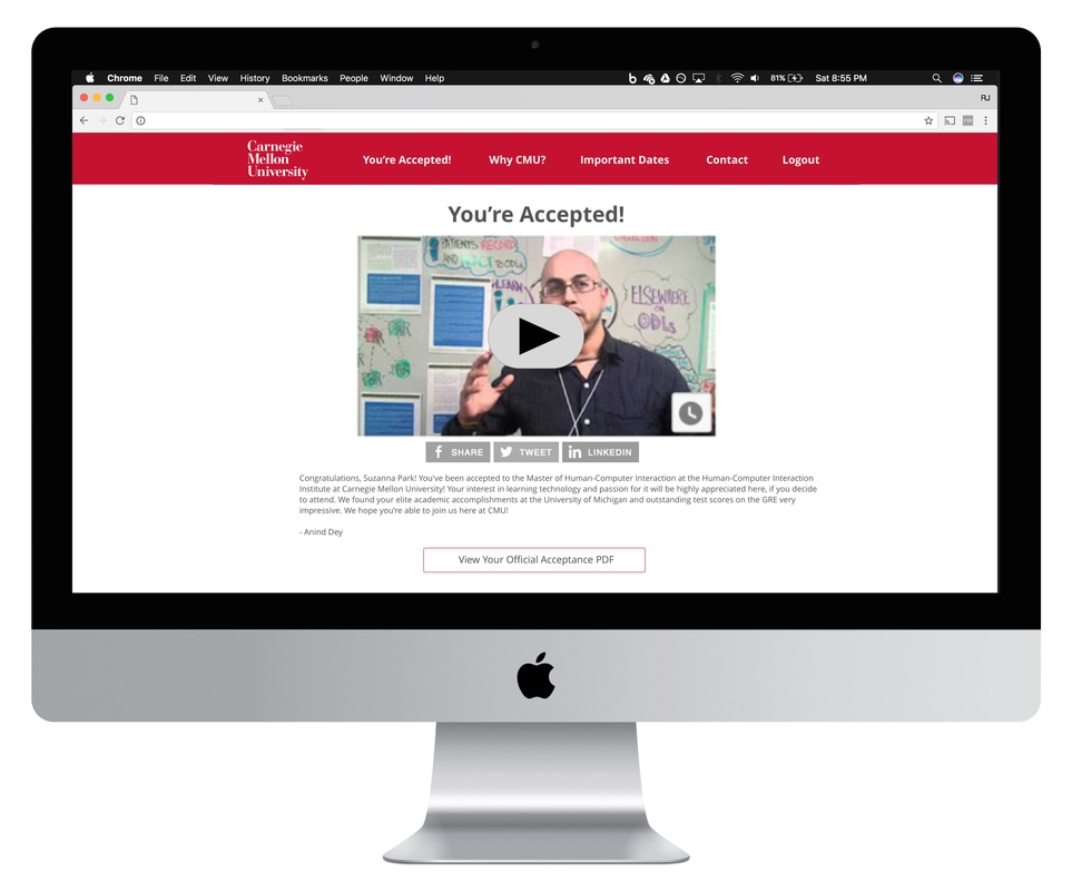
We tested the idea of having a text message notification for available admission results and an admission notification video. This was done with my project advisor, classmates, and interviewees. The ideas proved to be a fitting solution for the problem. However, some testers still wanted an email notification for available admission results and did not necessarily want to watch a video about their admission.
As a result, we still included an email notification as part of the experience in addition to the SMS notification and a transcript of the video content below the video. |
section 4/7
|
|
I created wireframes and tested them on, again, my project advisor, classmates, and interviewees. I found two possible problems:
As a result, I created the following changes:
|
|
section 5/7
|

|
|
|
|
|
section 6/7
|
|
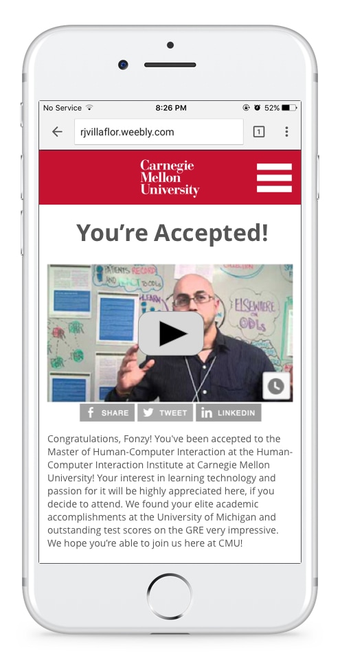
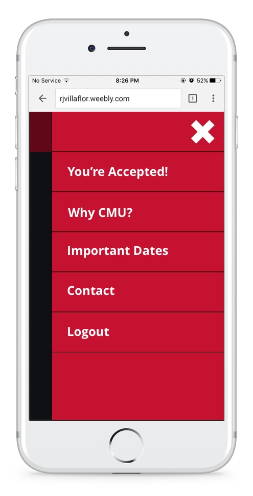
To better tell a story and progressively disclose information, we pivoted towards a one-page design.
Additionally, upon critique, we found that our visual design was actually using too much of the Carnegie Mellon branding. Specifically, we were overusing the branded red color. As a result, we used more neutral colors and reserved the red for the Carnegie Mellon logo. You can also see a model video of a CMU director accepting a student below. |
section 7/7
|