Process Overview
|
( part 1/10 )
|
Horarios do Funchal, the city's bus company, challenged us to popularize bus-use for the tourists in Funchal while not diminishing the locals' ability to use the same buses.
( part 2/10 )
|
The most effective transit designs "hand-held" their riders by visually directing them.
( part 3/10 )
|
( part 4/10 )
|
|

|
|
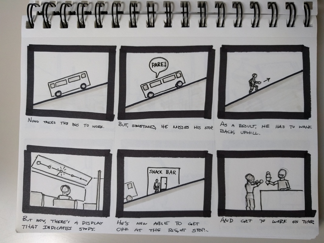
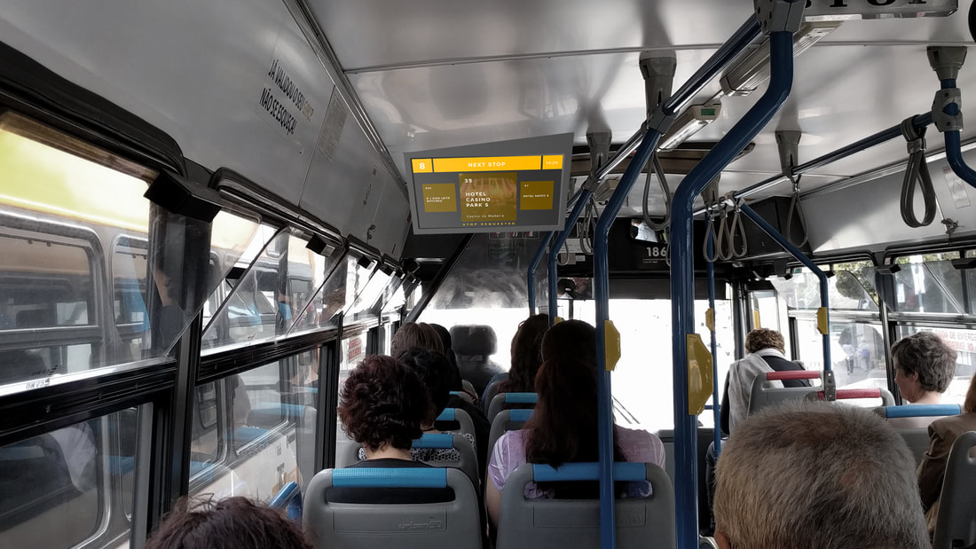
Finally, in this last storyboard, we use a simple computer-monitor-sized LCD on the bus to dynamically show the upcoming stop. This would allow the bus routes to be displayed in the bus without being a permanent installation. Additionally, it would provide tourists and idea of what stop to get off.
This was the concept we pursued. |

|
( part 5/10 )
|
( part 6/10 )
Creating a Display
Ideating and Visualizing Display
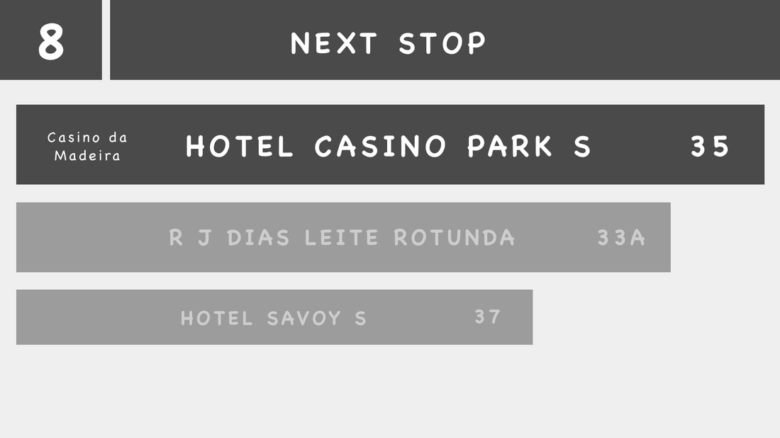
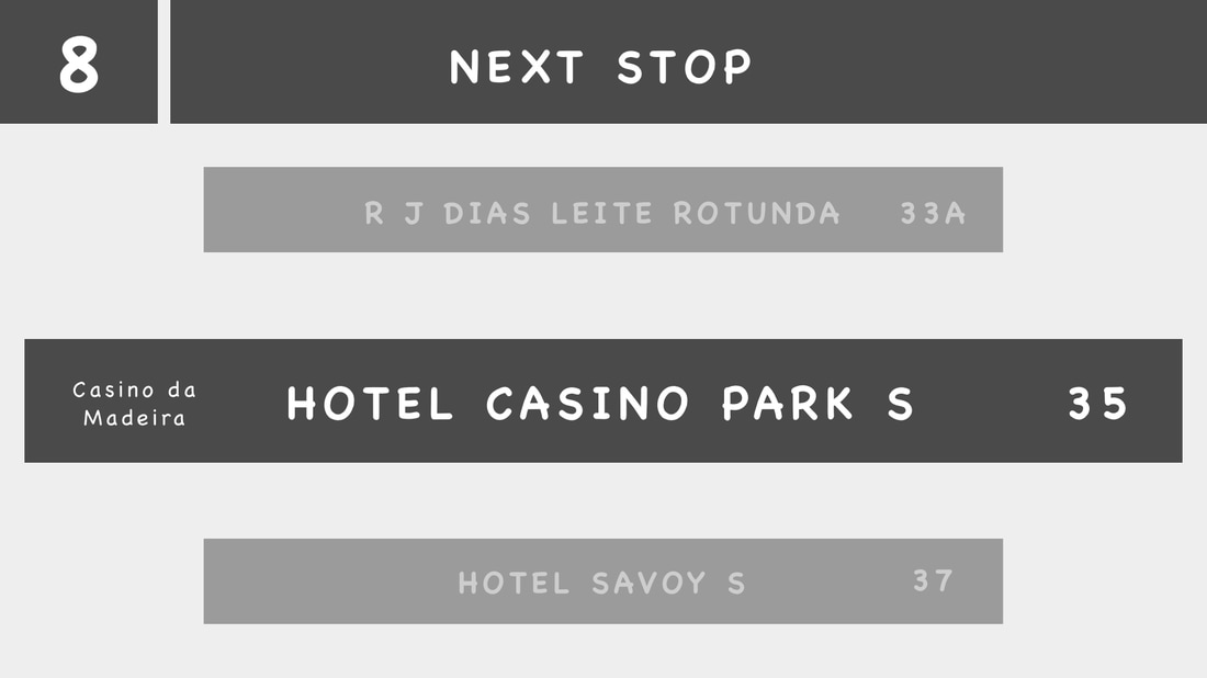
Iteration #1
|
|
I tried a few different designs and tested them. These first two wireframes did not communicate effectively what stops had passed, which stops were coming up, which stop was up next, or generally where the bus riders were.
Additionally, the text for the stop's feature (in this case, the casino) was likely not large enough for the typically older tourists on the island to see. Finally, the testers also wanted to know if they were arriving at their stop in time. |
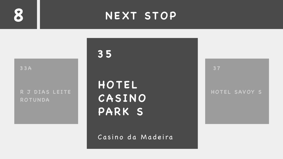
Iteration #2
|
I tried this wireframe and it appeared to be effective on our testers. It showed the stops as tiles with previous stop on the left, the next stop on the right, and the upcoming stop in the center. The testers reported that this provided them the best spatial awareness for where they were and what stop they would need to get off. However, the text for the tourist attraction was still too small.
|
Iteration #3
|
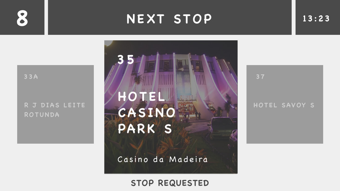
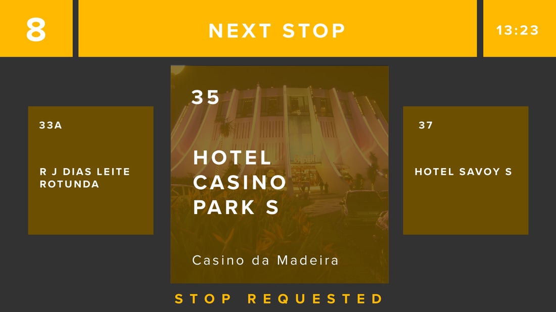
To supplement the text for the tourist attraction, I also added an image of the tourist attraction as the background for the tile. This tested well: testers reported that they were aware what stop to get off for a particular tourist attraction. Additionally, during testing, some users reported that they sometimes determine their stops by timing. As a result, we also included a clock in the upper right of the display.
|
Colors & Typography
|
Mock-Up
|
( part 7/10 )
|
In-Bus Display Model Video from RJ Villaflor on Vimeo.
( part 8/10 )
|
( part 9/10 )
|
|
( part 10/10 )
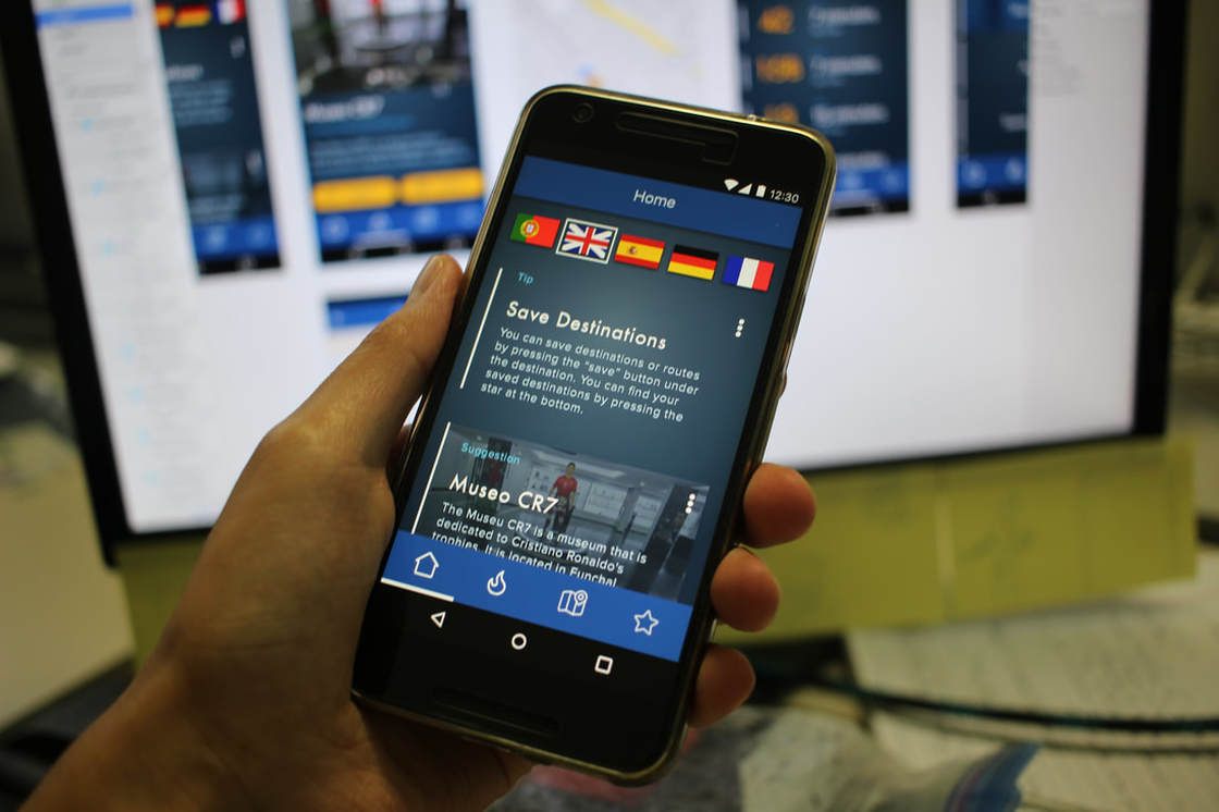
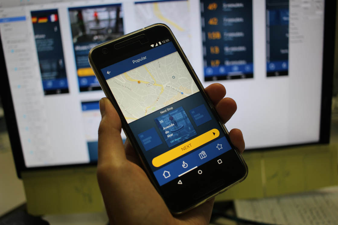
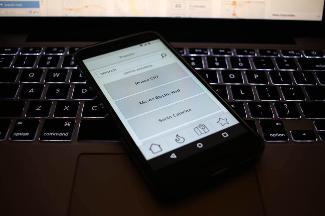
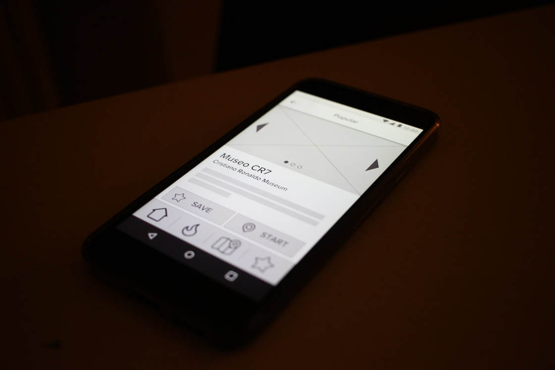
Ideating & Visualizing an App
Expediting the UX Process to Design an App
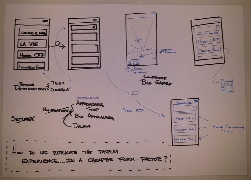
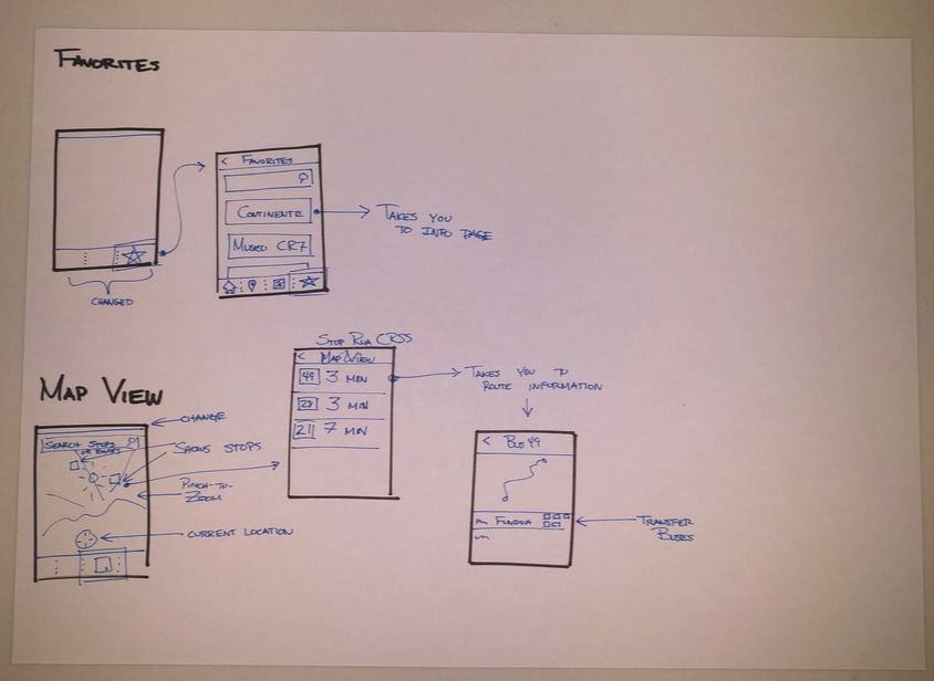
Sketching
|
|
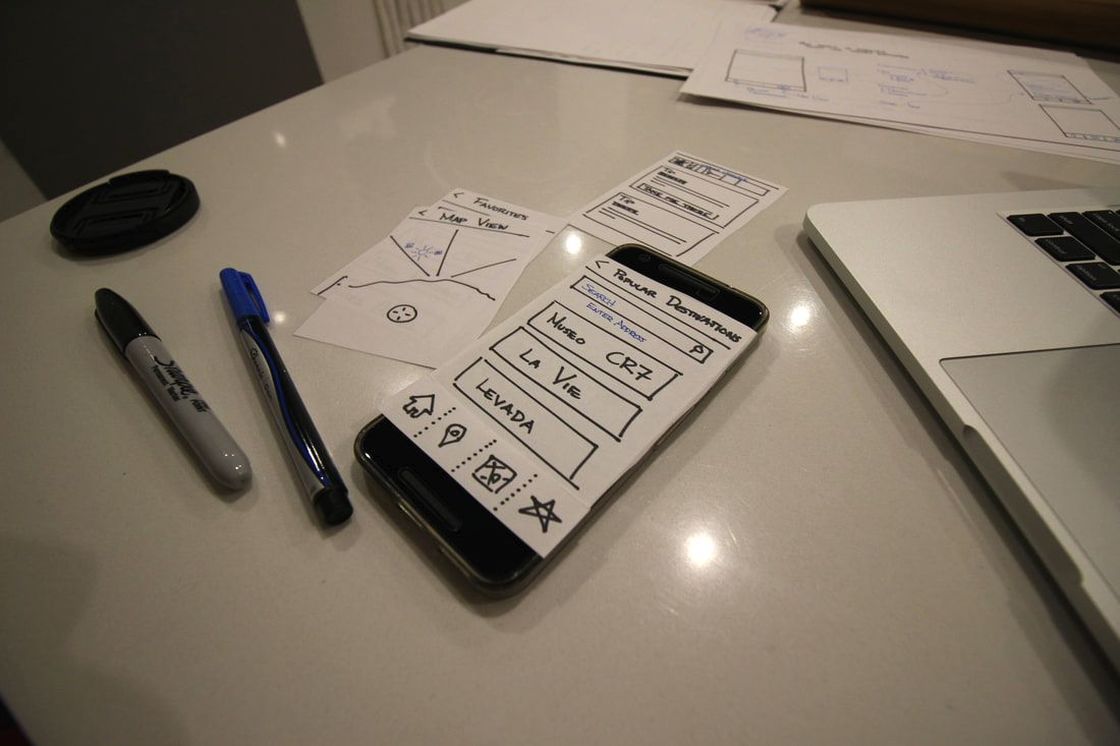
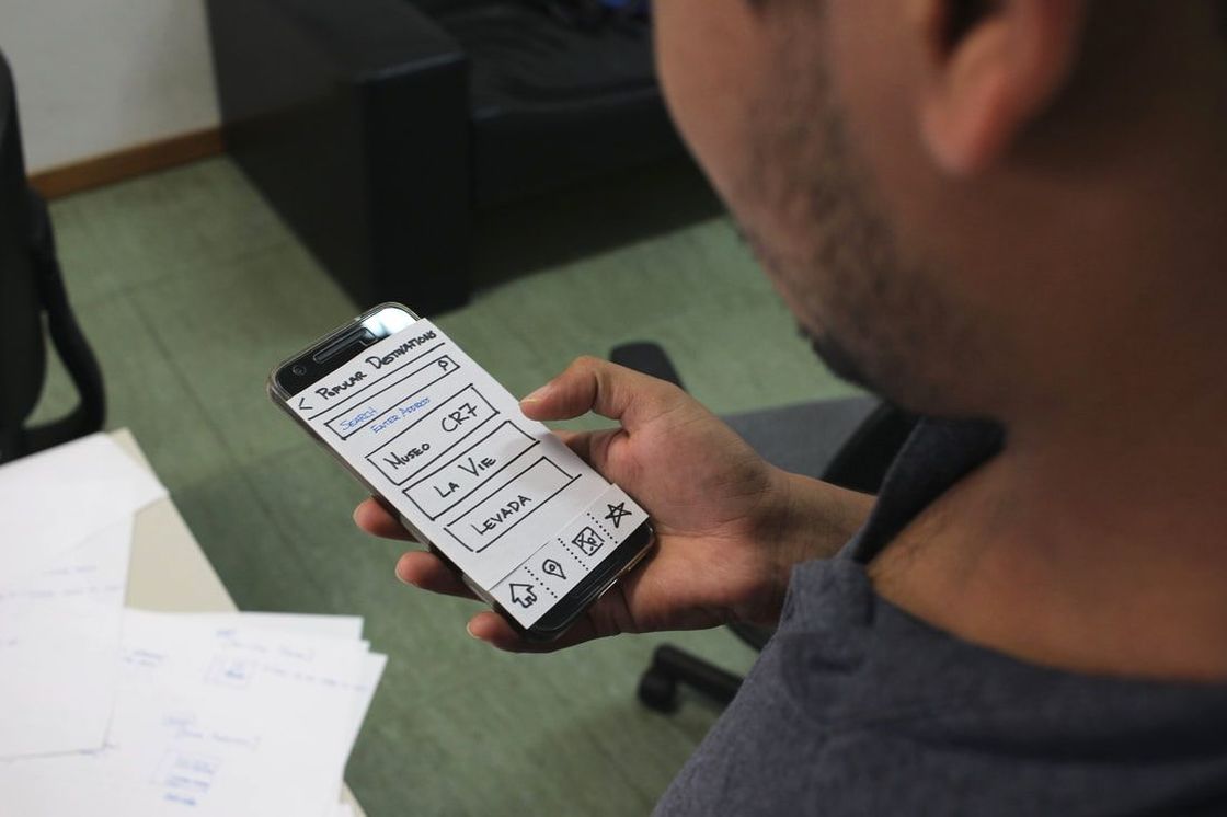
Paper-Prototyping & Concept Validation
Wireframing
Finalizing the Visual Design